CASE STUDY
Accessibility Study
ROLE
Sr. UX Designer
Sr. UX Designer
TEAM
Director of Product
iOS Development Team
Android Development Team
Accessibility Team
Director of Product
iOS Development Team
Android Development Team
Accessibility Team
THE PROJECT
The absence of accessible text settings in our company's mobile app may create an obstacle for users with disabilities to fully engage with the content, resulting in exclusion and limited access to vital information. This can reduce the value of our product and negatively impact our customer base, while also putting us at a disadvantage in the market.
By integrating accessible text settings into our mobile app, we can improve the user experience and enhance the value of our product. Providing larger font sizes on iPhone and Android devices will make our app more inclusive and accessible to a wider range of users, including those with disabilities. This will differentiate us from our competitors, who may not have invested in accessibility features and may not be accessible to users with disabilities.
Prioritizing accessibility in our mobile app will demonstrate our commitment to creating an inclusive product that values all users, regardless of their abilities. This will not only enhance the value of our product but also positively impact our reputation and customer base. By ensuring that our mobile app is accessible to all users, we can maintain a competitive edge and position ourselves as a company that values diversity and inclusivity, setting us apart from our competitors who may not prioritize accessibility. This will allow us to reach a wider audience, increase customer loyalty, and ultimately drive business growth
ACCESSIBLE TEXT
The Accessibility Team provided us with a text matrix detailing iOS sizes and classifications. This matrix serves as the foundation for all the work we have accomplished to date and is shown on the right-hand side.
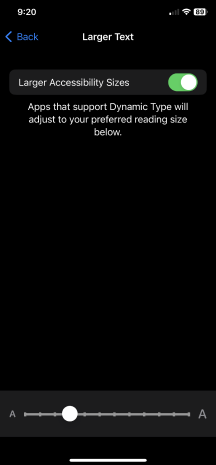
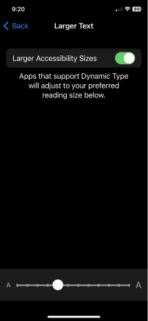
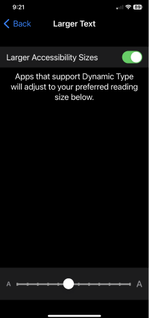
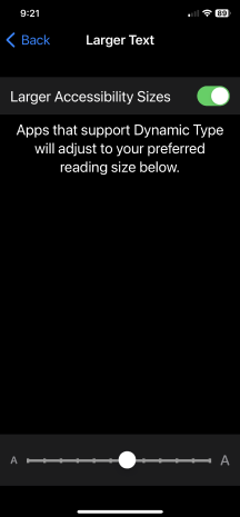
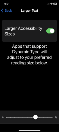
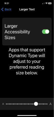
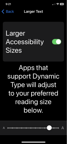
As illustrated below the matrix, we have included screen shots of all the corresponding iOS settings. Our goal was to ensure compatibility with settings 4 (default) through the 10th setting on the slider. The 10th setting is a 200% increase. This is the minimum legal obligation to comply with FCC regulations.
Using this information, I developed font class settings labeled “A4” through “A10” for our Figma mobile design library. These class settings are intended to promote accessibility, hence the “A” prefix. To achieve consistency between platforms, we used iOS as our baseline since it has established settings. This will guarantee that our app will adopt a common style sheet with both Android and iOS adhering to the same design.
PROJECT GOALS
CORE COMPONENT EXPLORATION
IDEATION – COMPLEX COMPONENT EXPLORATION
Mobile A10 (200%) Setting Exploration
Tablet A10 (200%) Setting Exploration
CONCLUSION
After a thorough analysis, I have determined that Spectrum can introduce text accessibility options without disrupting the existing platform or compromising usability and design standards. Spectrum's accessibility team proposes attainable settings that require a certain amount of development work, the extent of which is yet to be determined or estimated. I've confirmed these conclusions with developers who work on iOS and Android platforms.
For designers, we plan to integrate these accessibility settings into the Figma Design System. We'll add variants for the impacted components, permitting designers to adjust their page layouts based on the level of accessibility, “A” class required.
Moving forward, we need to determine our next course of action and establish a comprehensive rollout plan. This plan will entail outlining the necessary steps for implementation, determining the level of effort required for development, and establishing a timeline for completion. It is imperative that we gain a thorough understanding of the development efforts and timing involved in this process. Only then can we establish a well-informed and effective plan for moving forward.