CASE STUDY
Hill’s Pet – eCommerce Design System
My Role
Sr. UI/UX Designer
Sr. UI/UX Designer
The Team
UX Design Manager
UX Designer, main contact
UX Design Manager
UX Designer, main contact
The Challenge
Hill’s Pet had multiple libraries of existing components, but the shared Figma libraries lacked structure, consistency, and scalability. Components were built without proper use of variables, properties, or auto layout, making them difficult to maintain, customize, or adapt across light and dark modes. The fragmented systems created friction between designers and developers, slowed down workflows, and introduced inconsistencies across products. I was brought in to audit, reorganize, and rebuild the system—establishing a solid foundation with scalable components, design tokens, responsive auto-layout structures, and clearly defined properties to support flexible, real-world use cases across teams.
Hill’s Pet had multiple libraries of existing components, but the shared Figma libraries lacked structure, consistency, and scalability. Components were built without proper use of variables, properties, or auto layout, making them difficult to maintain, customize, or adapt across light and dark modes. The fragmented systems created friction between designers and developers, slowed down workflows, and introduced inconsistencies across products. I was brought in to audit, reorganize, and rebuild the system—establishing a solid foundation with scalable components, design tokens, responsive auto-layout structures, and clearly defined properties to support flexible, real-world use cases across teams.
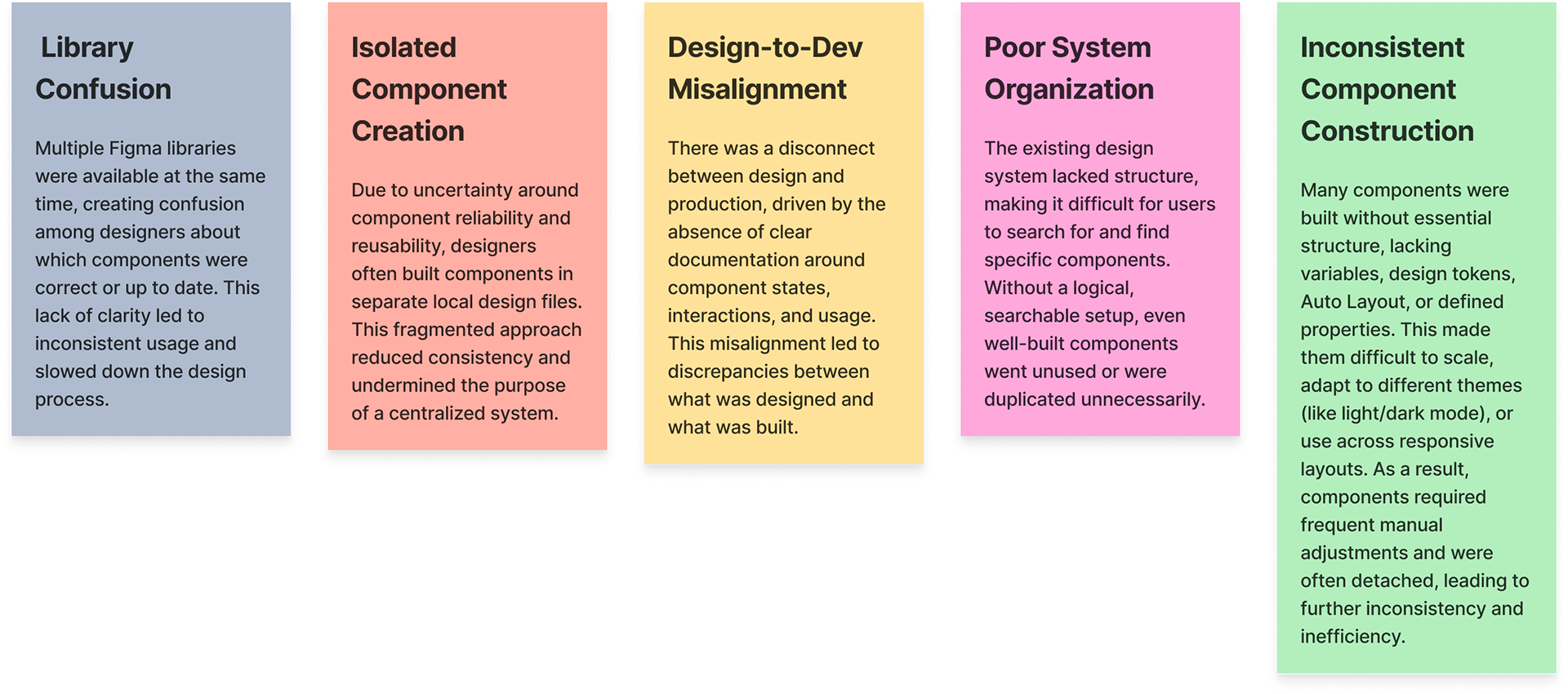
Problems to Solve
My Approach
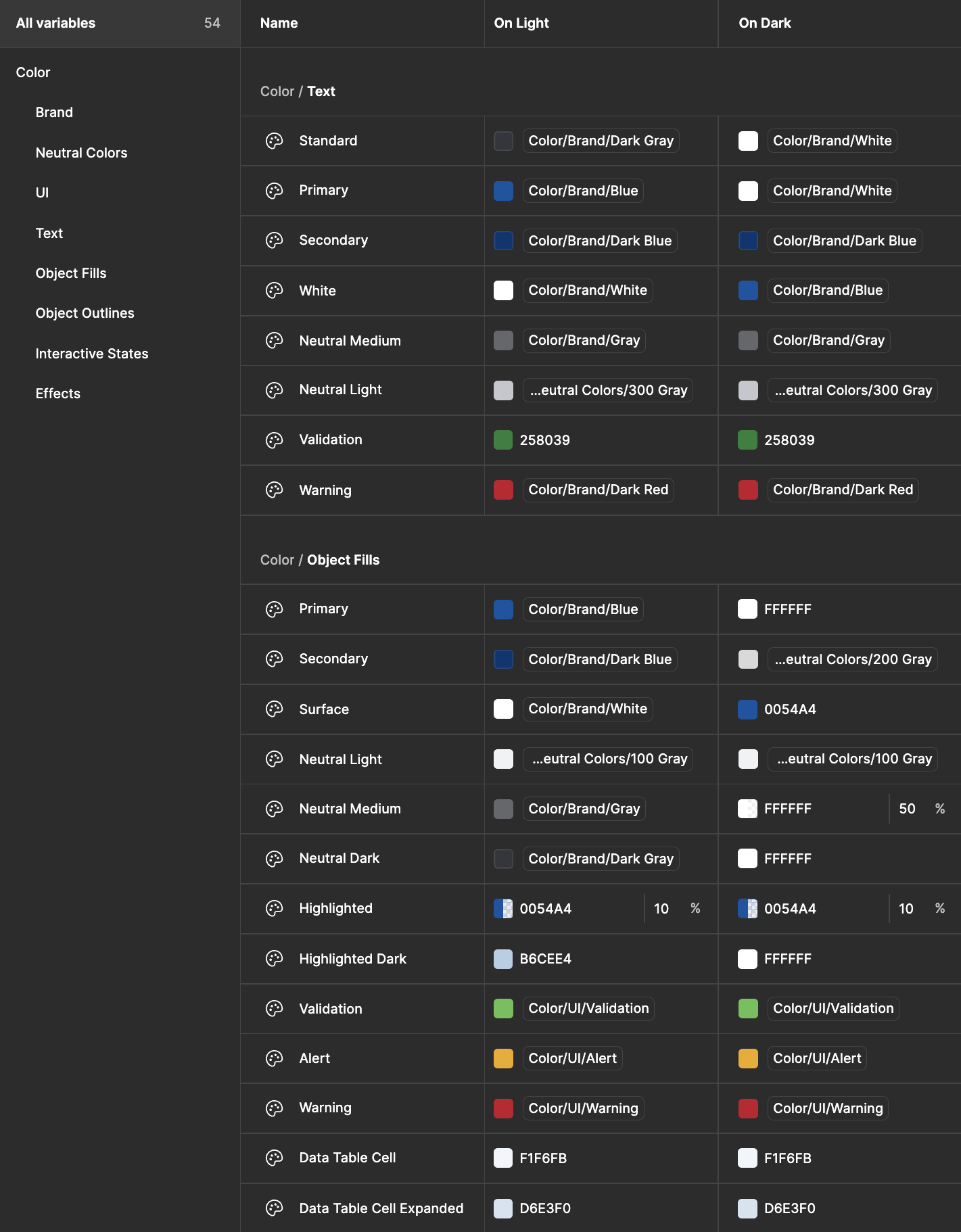
To address the fragmentation and inefficiencies across the design system, I began by thoroughly auditing all existing assets and libraries to understand what was usable, what needed rebuilding, and where gaps existed. From this foundation, I developed a structured plan focused on scalability, clarity, and alignment with development. The first step was establishing a comprehensive set of variables and design tokens to support theming and consistency. I then defined core atomic-level components—such as buttons, inputs, and icons—with Auto Layout, properties, and naming conventions that would serve as the foundation for more complex, reusable patterns. This systematic, bottom-up approach ensured that every component moving forward would be flexible, accessible, and easy for designers and developers to adopt.
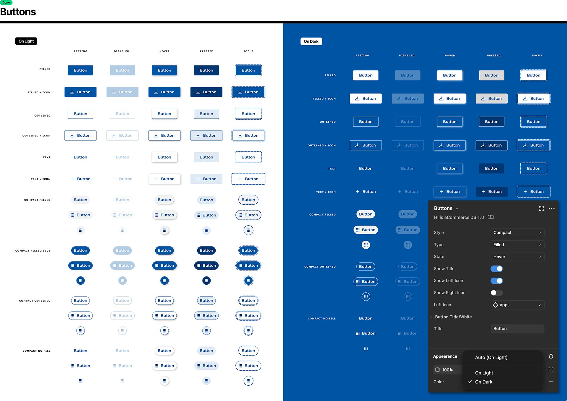
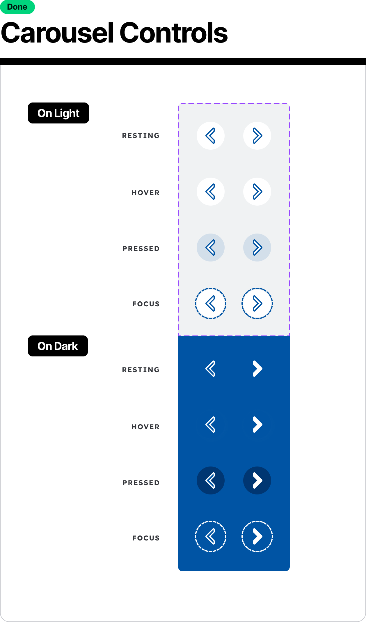
One particularly unique challenge I encountered was that Hill’s didn’t follow the traditional light or dark mode structure. Instead, components needed to be visually adaptable depending on whether they appeared on light or dark backgrounds within the same interface. To address this, I introduced a concept of “On Light” and “On Dark” modes rather than full theme modes. This approach allowed components to remain consistent and legible regardless of the background context. More importantly, it resonated with the design team and end users, who found the solution intuitive, practical, and easy to implement. The positive feedback confirmed that this tailored approach not only solved the problem but also improved clarity and usability across the system. Below is an example showing the buttons component, following the variables on the right:
One particularly unique challenge I encountered was that Hill’s didn’t follow the traditional light or dark mode structure. Instead, components needed to be visually adaptable depending on whether they appeared on light or dark backgrounds within the same interface. To address this, I introduced a concept of “On Light” and “On Dark” modes rather than full theme modes. This approach allowed components to remain consistent and legible regardless of the background context. More importantly, it resonated with the design team and end users, who found the solution intuitive, practical, and easy to implement. The positive feedback confirmed that this tailored approach not only solved the problem but also improved clarity and usability across the system. Below is an example showing the buttons component, following the variables on the right:
Organization and Philosophy
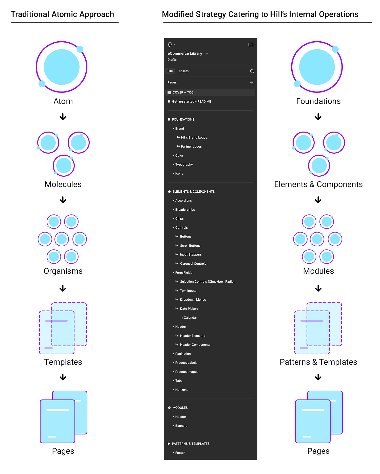
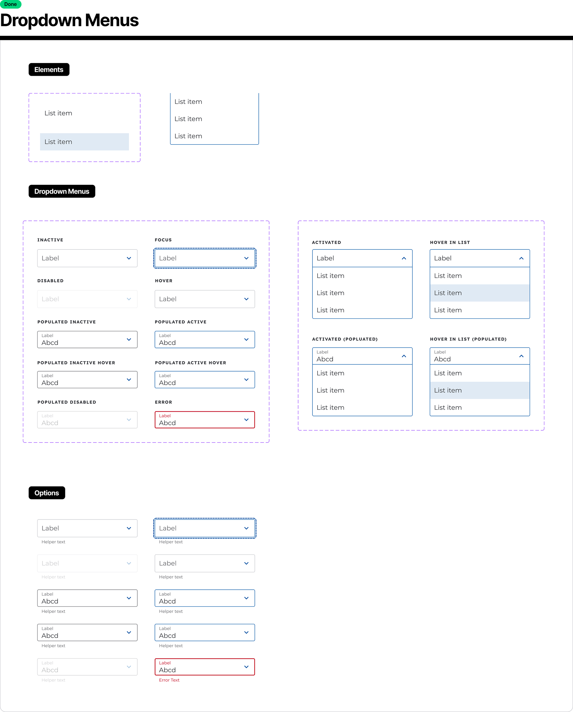
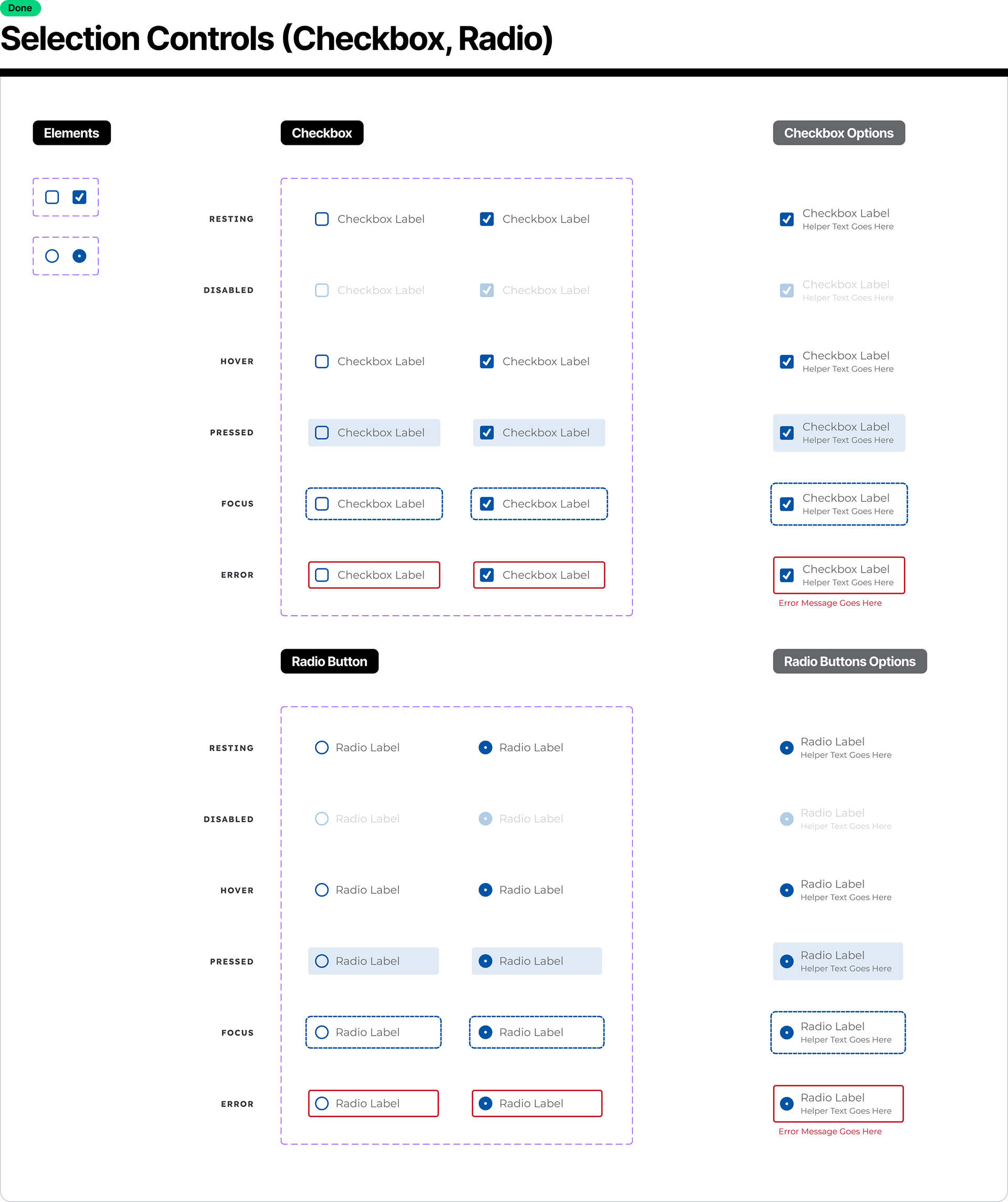
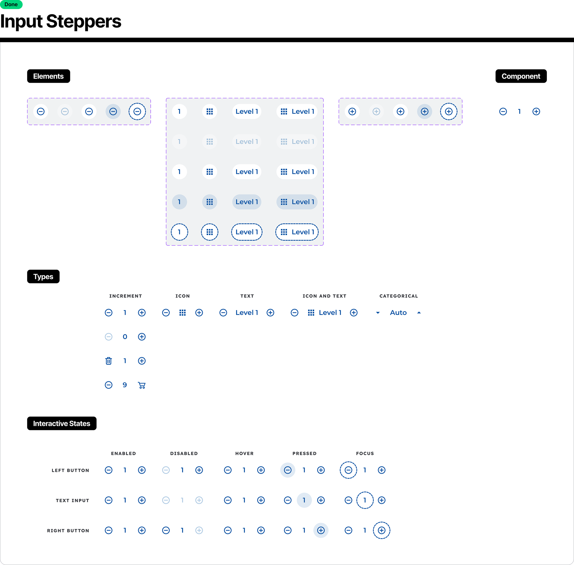
For Hill’s eCommerce Figma Design System, I was tasked with creating a new organizational model that aligned with their existing components, workflows, and team structure. While traditional atomic design provided a useful starting point, it didn’t fully accommodate the complexity or practical needs of Hill’s design process. In response, I developed a custom design system philosophy tailored to their environment—one that preserved the spirit of atomic design while introducing clearer, more intuitive terminology.
I redefined the hierarchy to better reflect how the team actually thought about and built their UI:
Atoms became Foundations
Molecules became Elements & Components
Organisms became Modules
Templates remained Templates & Patterns
Pages represented fully assembled designs
As I evangelized this new structure with the client, I simultaneously worked on building new, reusable components and began reorganizing the existing library to reflect this framework. This approach gave the team a more flexible, scalable, and comprehensible way to navigate and extend their design system—grounded in real use, not just theory.
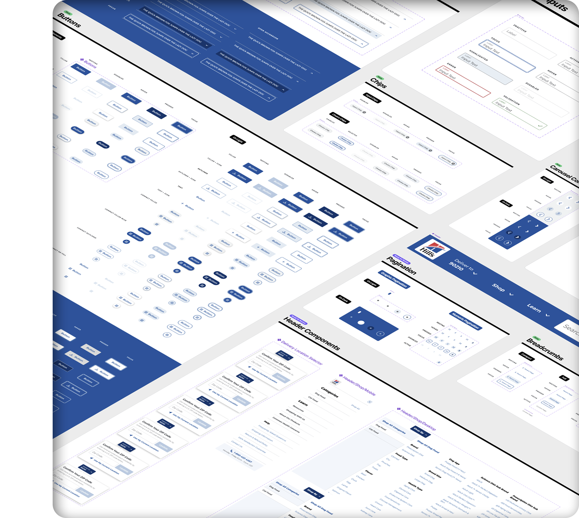
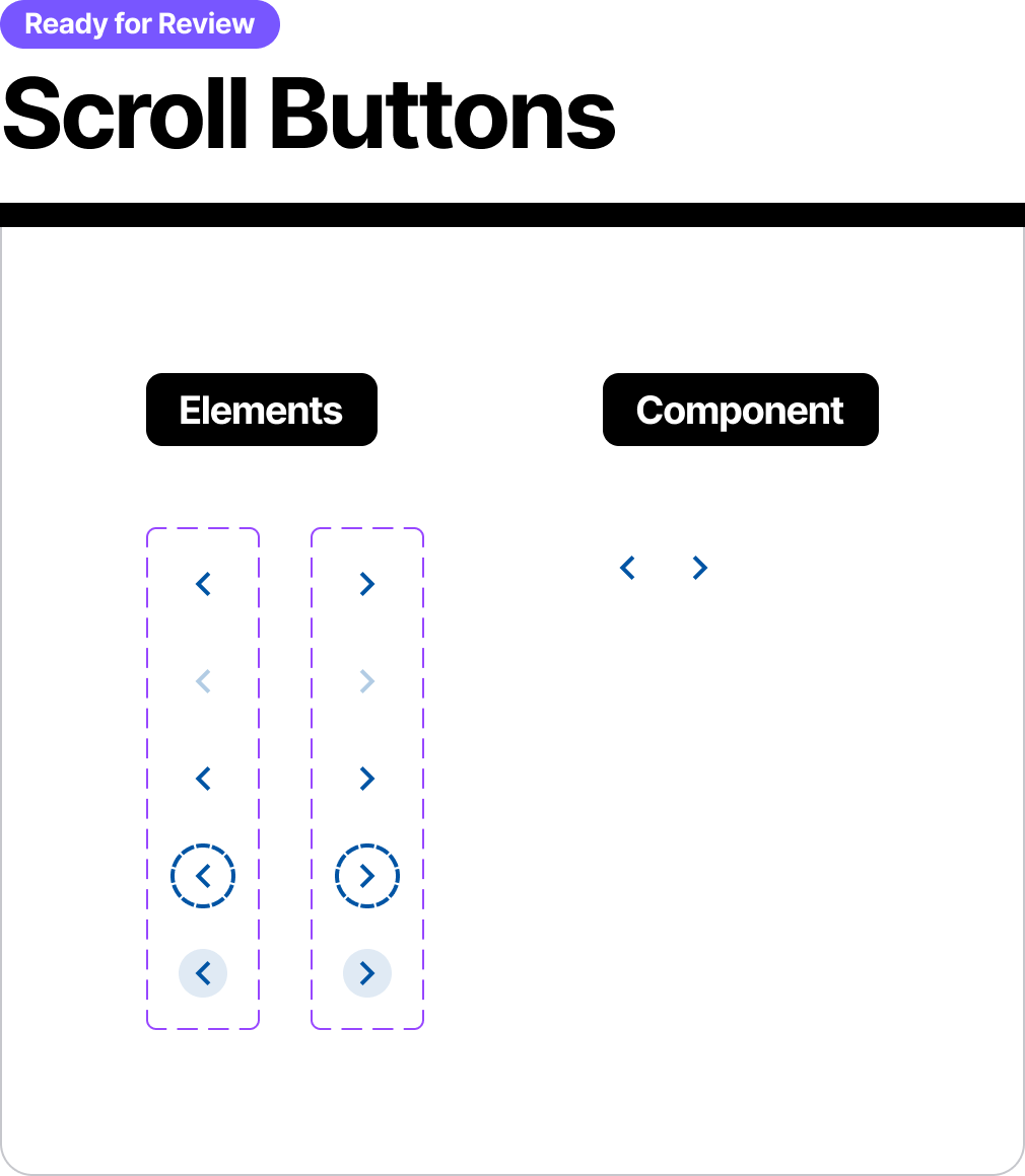
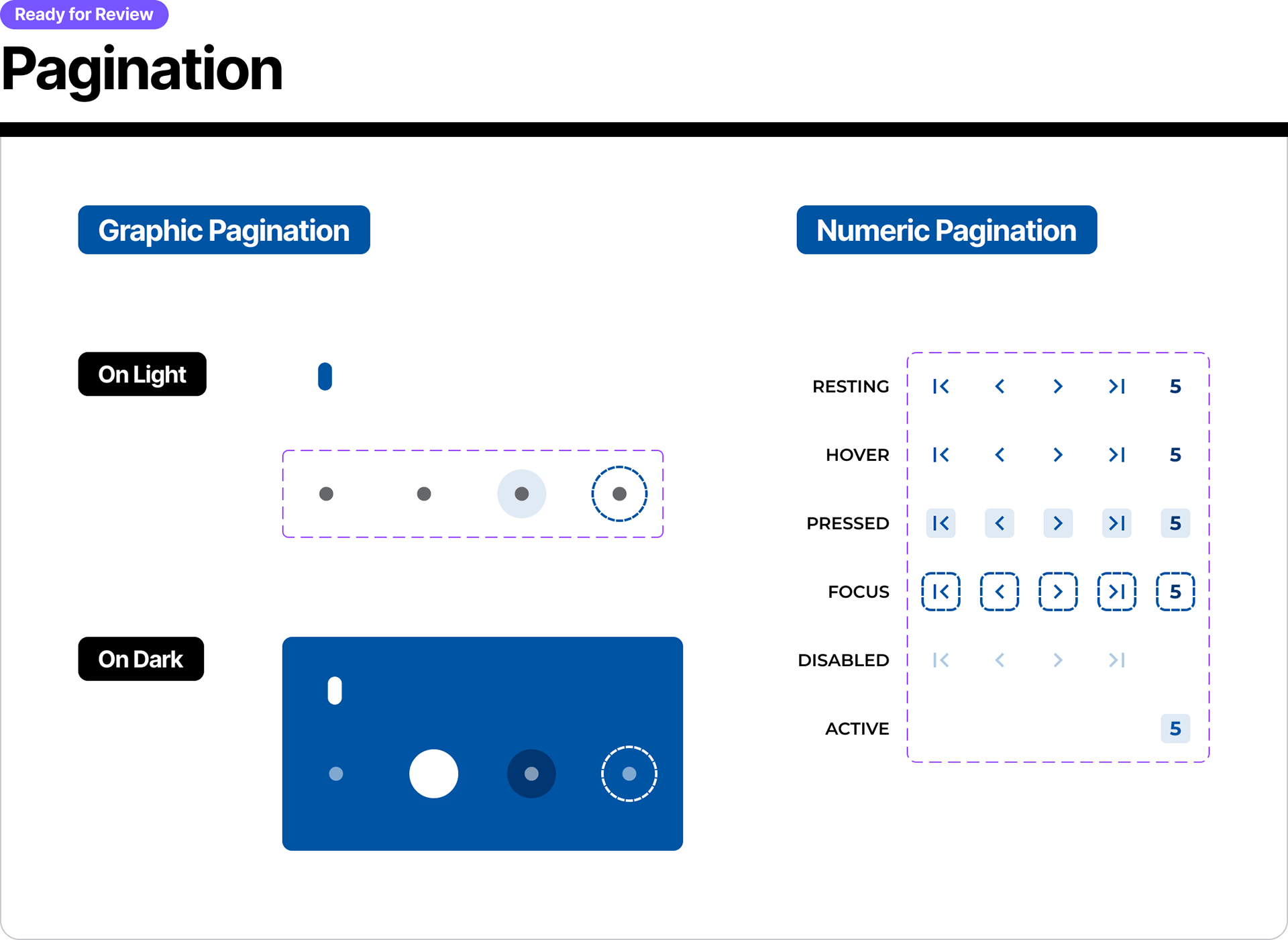
Examples of Elements & Components as well as "On Light" and "On Dark" in the library:
Conclusion and Results
By the end of the 6-month part-time engagement, Hill’s Pet was equipped with a robust, flexible, and scalable design system tailored to their specific needs. The delivered system included approximately 75% of the component library needed at the time, covering all foundational elements, core components, and commonly used modules. Just as importantly, the design system was structured to empower their internal team to confidently build the remaining components independently.
The system included clearly defined guidelines, thoughtful use of variants, properties, and Auto Layout, and well-documented examples to support consistent usage and future growth. The client expressed strong confidence in the system’s structure and usability, and the handoff was smooth—thanks to the intentional focus on education, alignment, and system scalability throughout the process. Hill’s was left with not just a set of components, but a true design foundation they could maintain and expand with clarity and consistency.